

In-depth Report | From Royal Heritage to Digital Horizons: The Evolution of the National Bank of Egypt’s Identity Over 125 Years
Cairo – Mostafa El masry:
In the heart of Cairo, specifically in 1898, it was not merely the doors of a bank that opened for the first time, but rather the birth of a national economic identity destined to shape the Egyptian consciousness.
For over 125 years, the National Bank of Egypt (NBE) has been more than a financial institution safeguarding savings; it has been a mirror reflecting political shifts, architectural evolution, and the technological revolution of the modern era.
This transformation is not only evident in financial ledgers but is vividly embodied in its “visual attire”—a logo that has evolved to narrate the story of a nation.The Beginnings: Royal Prestige and Classical CalligraphyAt the dawn of the 20th century, the logo echoed the spirit of the age: “Sobriety and Dignity.” Influenced by official royal aesthetics, the bank’s early identity relied on intricate classical Arabic calligraphy.
At a time when the concept of “banking” was nascent in Egyptian society, this visual identity aimed to instill trust. The use of elaborate motifs suggested security and historical depth, emphasizing the name “National Bank of Egypt” as a unifying entity representing the “People of Egypt” against the foreign banks of that era.
The Middle Era: The “Temple” Philosophy and the Significance of Green
As decades passed, particularly in the latter half of the 20th century, the logo transitioned toward a more defined and symbolic form. The iconic word “Al-Ahli” (The National) appeared in Square Kufic script—a brilliant artistic choice. Kufic calligraphy evokes themes of construction and establishment, projecting an image of the bank as the “structural bedrock” of the Egyptian economy.
During this stage, the bank solidified its association with dark green. This choice was far from arbitrary; in the Egyptian psyche, green symbolizes growth, prosperity, and the historical hues of the former royal flag, as well as the fertile agricultural lands that were the backbone of the economy. The logo became a “talisman” of sorts, trusted by farmers, merchants, and employees alike.
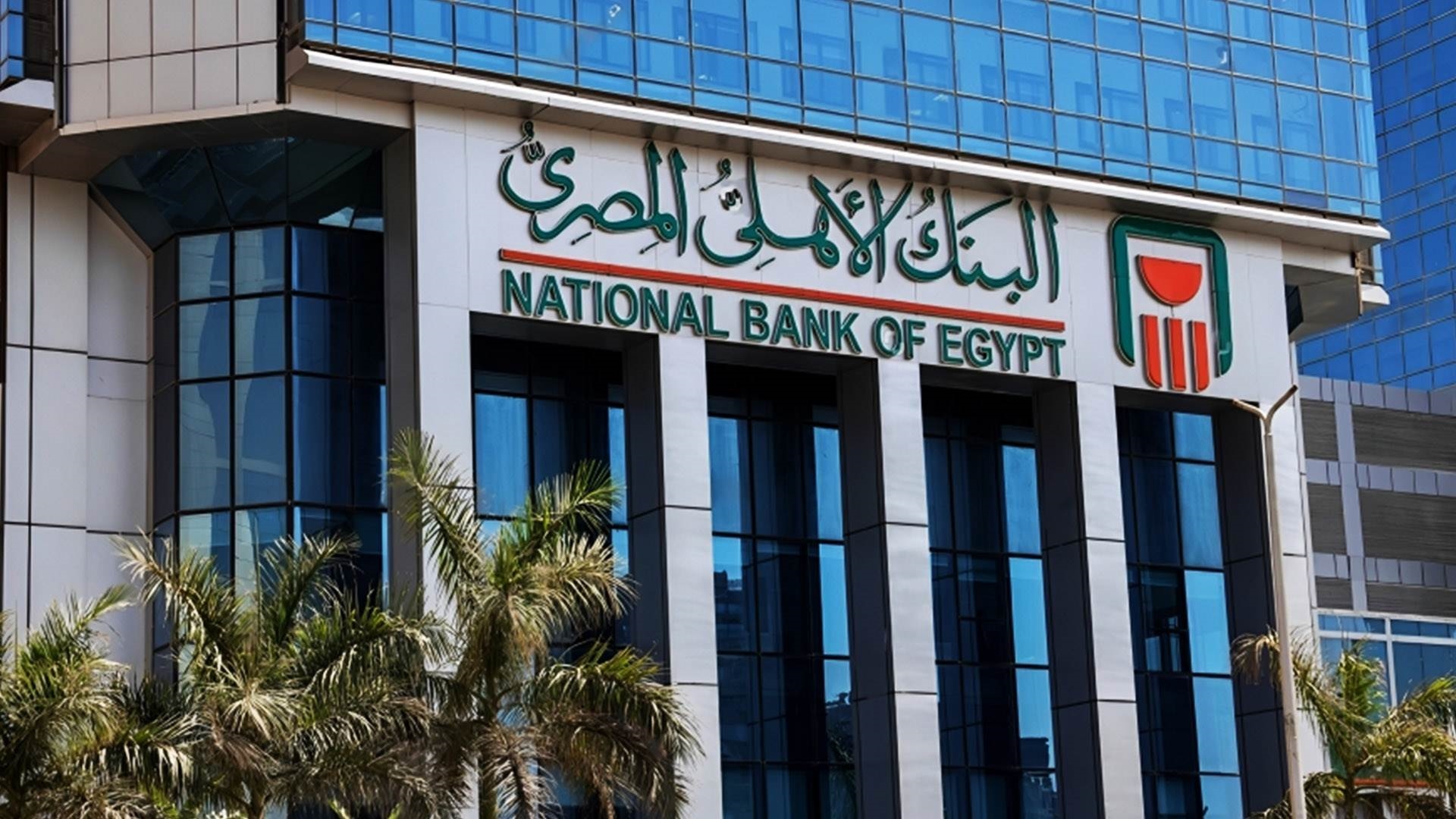
The Digital Revolution: Trading “Complexity” for “Agility”With the onset of the third millennium and the accelerating pace of technology, NBE recognized that “classical prestige” alone was no longer sufficient in the age of speed. The most recent transformation sparked a comprehensive visual revolution, simplifying the logo and stripping away redundant ornamentation.Why was this shift necessary?
* Digital Compatibility (UI/UX): Legacy logos with intricate details lost clarity when scaled down for smartphone screens or mobile banking apps. The current logo’s minimalism makes it a technically perfect “icon.”
* Engaging the Youth: The bank no longer targets only “large asset holders” but has pivoted toward Gen Z and Millennials, who prioritize simplicity and speed.
The Philosophy of Openness: The open lines in the new design suggest flexibility and the capacity for evolution, signaling a bank that embraces the future and financial inclusion for every citizen.
The Logo: An Unbroken Covenant
The journey of the National Bank of Egypt’s logo is one of “visual maturity.”
From the decorative Arabic scripts that once graced “Para” and “Piaster” invoices to the smart icon now seen on ATMs and smartphones, the core remains unchanged: “The Bank of the Egyptian People.” These transitions were never a departure from heritage, but rather a sophisticated reimagining of authenticity in the language of the modern age.