

The Philosophy of Color and Identity.. How CIB’s Visual Brand Shaped Modern Banking in Egypt
Cairo – Mostafa El Masry:
in the world of finance, a logo is far more than graphic design—it is a promise between an institution and its clients.
Since its origins as a partnership between Chase Manhattan and the National Bank of Egypt in the 1970s, up to its leadership of Egypt’s private banking sector in 2026, the visual identity of the Commercial International Bank (CIB) has undergone major transformations.
These changes were never about fashion trends; they reflected the bank’s evolution from a local corporate lender into a globally minded financial technology institution.
Key Stages
1975–1987: A formal, conservative visual style inspired by Chase Manhattan.
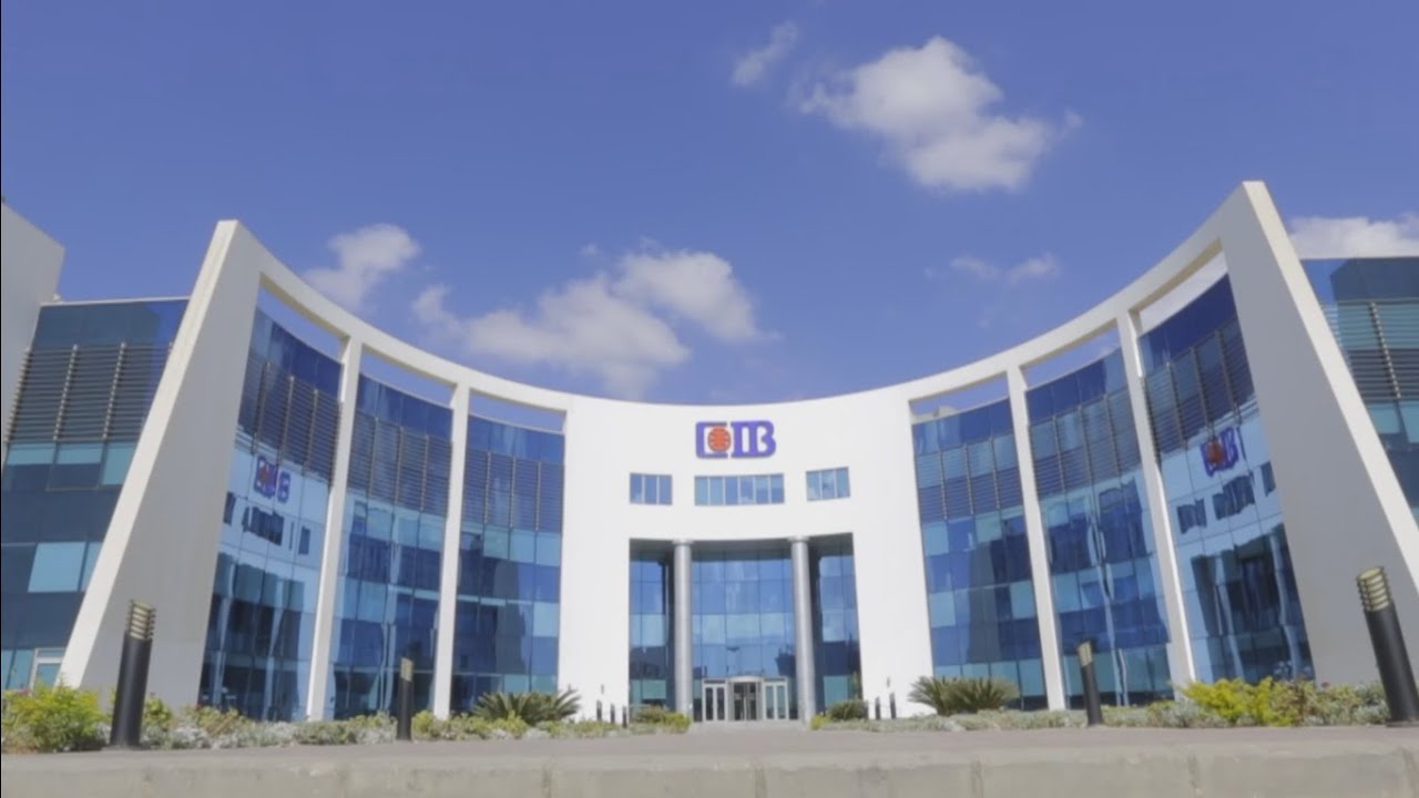
1987–2000: Adoption of the iconic CIB initials and the deep blue tone symbolizing trust and stability.
2000–2015: Expansion into retail banking with warmer, customer-focused campaigns such as “A Bank You Can Trust.
”2015–2026: Minimalist digital branding optimized for mobile platforms, user experience, and younger audiences.
Conclusion
CIB’s branding success lies in consistency. While the design evolved with each era, the core message remained unchanged: trust, efficiency, and modern financial leadership.